
Anxiety Sucks: Book Series Design
For this fictional project, I collaborated with Penguin Publishing to design a cohesive set of book covers for the Anxiety Sucks self-help series. The challenge was to visually communicate sensitive topics like anxiety in a way that feels bold, honest, and emotionally supportive—while also standing out in both physical and digital marketplaces. The goal was to create approachable, impactful designs that help readers feel seen and encouraged to engage with difficult subjects in a relatable way.


The Problem
How can a book series connect with readers on an emotional level while remaining visually appealing, marketable, and honest?
The goal was to create a cover design that reflected the impact and severity of anxiety through imagery while without alienating the audience or sacrificing clarity. The challenge was to balance emotional expression with typography, color theory, and a unified visual identity that appeals to those seeking support or understanding.
The Solution
Distressed typography, rich color palettes, and symbolic imagery were used on the covers to communicate the emotional weight of anxiety while remaining relatable to readers. Each design achieves a balance between expressiveness and clarity, guaranteeing that the covers remain emotional while remaining visually organized—satisfying the needs of both the audience and the fictional client. Cracked and worn typefaces imply instability, however vibrant colors like yellow and red express urgency, intensity,and high visibility.
-
Book I
Anxiety Sucks: Unleash Your True Potential and Be Worry Free creates a sense of urgency and tension by using a vivid yellow background with black and red typography. Strength is symbolized by the lotus— growing through difficult times symbolizing hope in during times of hardship.

-
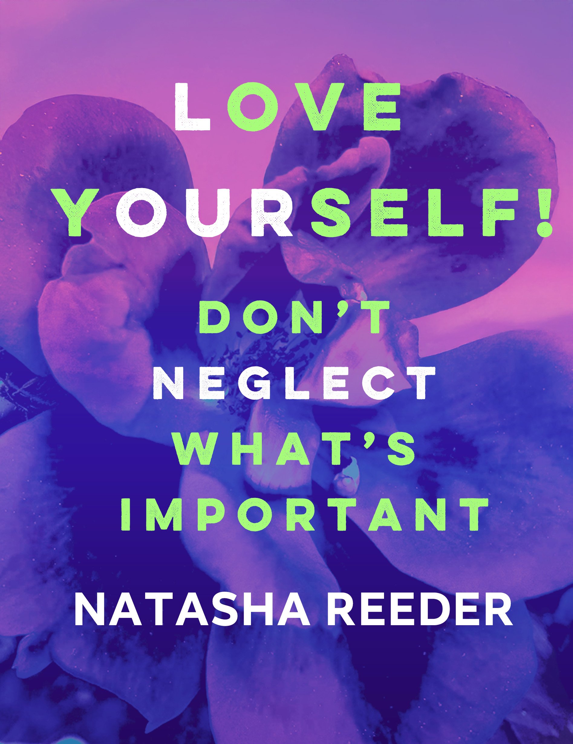
Book II
Book II: Love Yourself: Don't Neglect What's Important: Love Yourself reflects reflection and rebirth through its deep purple background and green and white writing. The rose reflects mental strength, vulnerability, and the beauty that results from total self-acceptance.

-
Book III
Book III: The Power of Mindset: Be the Person You Want to Be: The Power of Mindset uses green, yellow, white, and purple tones that represent growth and positivity. The spider reflects the slow, tangled nature of overthinking, expressing how thoughts can either trap or release us, depending on how we handle it.on goes here
